




Study 03 · Author and podcaster
Tim Ferrisstim.blog
A cinematic portrait hero, proof before anything else, and a newsletter whose content is only sent by email.
Visit tim.blog(opens in a new tab)tim.blogNot RURO work
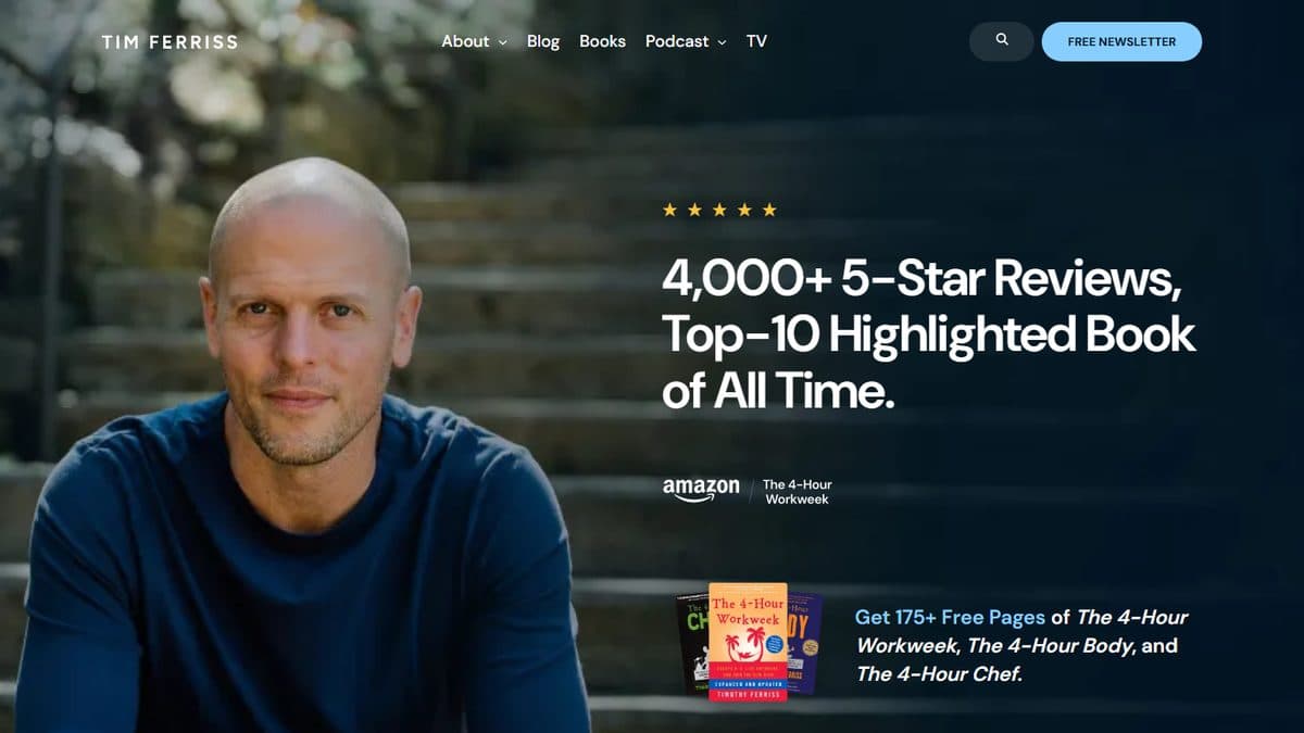
Homepage as captured on 8 October 2026. RURO did not build this site and has no connection with Tim Ferriss. The site and image belong to their owner.
01 · The concept
The idea in one line.
Lead with proof, then make one clear offer.
- Signature
- 5-Bullet Friday
- Address
- tim.blog
02 · Design
How it looks.
- Midnight #051824
- Sky #86d4ff
- Star gold #f8c43b
- Layout
- A full-bleed hero split in two: his portrait on the left, the claim and the offer on the right.
- Type
- Widely spaced capitals for the TIM FERRISS wordmark; a heavy, tight sans for the headline about the book’s reviews.
- Imagery
- A warm, natural portrait under a dark overlay, plus the covers of his three “4-Hour” books.
- Colour
- Midnight navy with one light-blue button and five gold stars. Very little else competes.
03 · Functionality
What it does.
- 01Navigation: About, Blog, Books, Podcast and TV, plus search
- 02A permanent “Free newsletter” button in the header
- 03A lead magnet offering free pages from the 4-Hour books
- 04A podcast archive with full transcripts
04 · The luxury, decoded
Why it feels premium.
01
Proof first
The first words are a review count and a ranking. Credibility arrives before the pitch does.
02
A face, not a logo
The large, relaxed portrait makes a media brand feel personal.
03
Exclusivity
Keeping 5-Bullet Friday to email makes subscribing feel like being let in.
05 · For your estate
What we would borrow.
- Open with the strongest proof you have, stated plainly.
- Use one high-contrast colour for the single action that matters most.
- Give subscribers something they cannot get anywhere else.